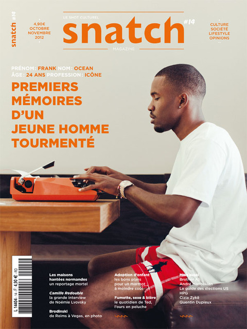
Album: Channel Orange
Key features used to brand the artist
For this album the cover and the name of the album link. The name of the album is Channel Orange so the cover is naturally orange. Ocean titled the album as a reference to a neurological phenomenon in which an individual's perception of numbers and letters is associated with the experience of colours. This can be noticed with the inner album artwork as it's design is numbers/letters/colours. The second booklet contains a story written by Frank Ocean about the first time that he fell in love, as it was summer and he perceived everything to be Orange.
Key features from a Music Video
Link: http://www.youtube.com/watch?v=s26qTrH2atA
The music video is played out like a mini film. There are subtle signs of the trademark Orange around the video, such as the orange drink in the shot glass, the orange cover over the vodka bottle and the orange light in the pyramid.
There are also the smpte colour bars cutting between the scenes of the video that we can see on the inner album art of Channel Orange.
In the last few shots we see a pyramid in the background which links to the song itself.
Promotional Material

(Coloured orange to link to the album)
Key Main Features
The key main features that I have noticed are:
- Choose something recognizable (a colour)
- Subtlety works just as well as something obvious
- Something that can be promoted on various types of media (Colour can be used for text/on video)
- Something that a mass audience would use and see
- Something that can be linked to your music


No comments:
Post a Comment