Fonts:
The font I would like to use:
 I like this font as it is simple, clear and easy to read. While many acts go for a more eye-catching font as something to set them apart, I prefer to go with this font. It's not so plain that it's Times New Roman and it's just unique enough that a fan would recognise it. Really I just like it because it ties in with the look of the album I'm going for which is a kind of clear simple look nothing too cluttered or in your face. This font is similar to the one used by Kanye West (and now Justin Bieber I suppose) in the album covers I posted earlier on this blog. While I no longer want to do an album cover THAT simple, I still plan on using some of those elements (like this font)
Colours:
I will mainly be keeping it with the kind of black and white look we had in the video but inverted I suppose. It will be more white/light grey than black. However it won't be "black and white" I want some carefully selected muted colours on it that will match the minimalist graphic design-ish feel I'm trying to achieve, although the video was black and white that was not our method of synergy (diamonds are) so I think this will be ok.
 |
| The more monochromatic colours used |
 |
| A selection of the 'colour' colours featured |
Layout
I think I will just go for the four panel digipak. If it can be said in four panels why make six.
Design
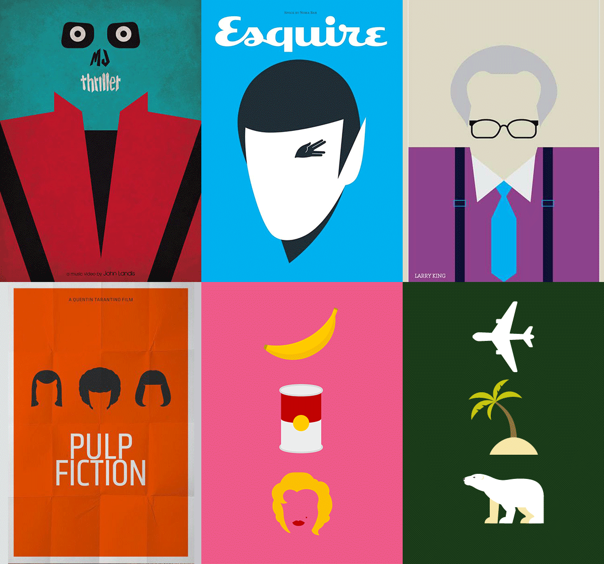
The design I suppose will consist of the features above I've mentioned. To be a little more clear about the 'minimalist graphic design' look I was talking about, here are some examples of the kind of look I was talking about that I will use.
I'm not as good as those guys but I'm just gonna try and do my own take on that style. So here's an example of that for The Jewellers:
 |
| Before and after (obviously) |
So yeah that's my plan.


No comments:
Post a Comment