Thursday, 19 December 2013

Three Potential Adverts

I have made three different versions of an advert. I think they're all basically ok and what I want them to be but the difference is the small line of information under 'THE DEBUT ALBUM' above '24.05.14'. I don't know which is the most appropriate for genre conventions/looks the best so I will look back on these in a while.

Image and video hosting by TinyPic
1. CD/DOWNLOAD - This takes up the space nicely
and I have seen this type of thing on album posters
before, but usually only when it involves some kind
of special edition 2CD or vinyl or something. It doesn't
look as good for just CD and download.


Image and video hosting by TinyPic

2. Includes the singles '...' - Probably my favourite,
fills the space well and a common feature I've seen
on many other album adverts.


Image and video hosting by TinyPic
3. Nothing - I think this looks a little too plain so I doubt I will use it.

Reason for Design

I decided to not use photo's in my digipak, this is because I think that the Indie Rock genre focuses more on the music other than the people in the band, This is backed up by other debut albums which don't have images of the band etc all over it;


I liked the simplicity of these and think that even though there are no faces it still sends a message and makes you look at it and think, It can also be very recognisable with synergy not just the band faces.

Working in Photoshop


Here are a few tools I used in photoshop in order to make my digipak.

Firstly, the colour tool allowed me to change certain parts of text in my advert so half the words were white and half were a deep red colour, I got this colour myself and saved it in the colour pallet in order to use it over and over again easily.

I then used the Gradient tool to make my background, I clicked it and then dragged a line down the page in order to create the gradient effect of the two colours i chose, which were black and a very deep grey blue.
The distort tool was very very useful in making the text wrap to the shape of an object, I used this in the album logo very effectively and I think it came out great.

Finally, I placed images into the picture and moved them around and resized them to my advantage in order to create logo's for different company's.

Final Ancillary Work

Album:


Advert:


Feedback on Draft

I got some feedback from my draft version of the ancillary work from my teachers.

Firstly, The Advert;

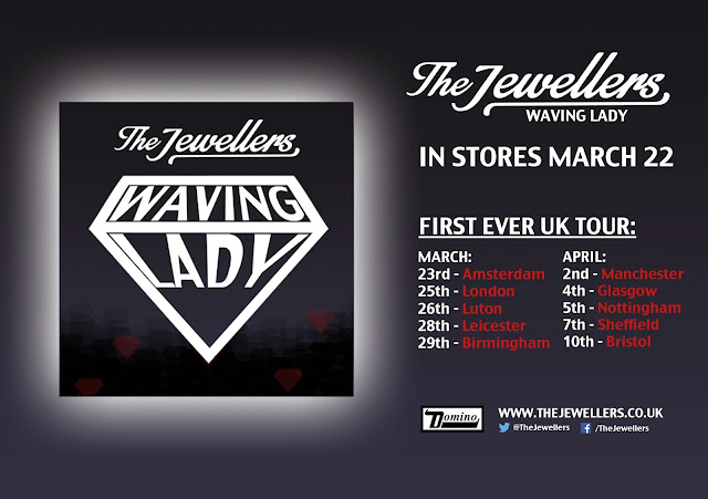
I was told to add more dates into the tour as it would be normal for them to have up to about 10, not just 3, also I was told to either use venues or places not a mix because it is confusing.
I was then told to change the 'OUT NOW' sections o it's all on one line, and add in some more social media, so I added a twitter and facebook link for the audience.

Front;

My teacher said that the bottom of the album cover looked a bit plain and told em I should add a sticker or something to fill up the space a bit. I tried adding sticker's but thought they looked tacky and took away from the rest of the cover so I decided to leave it how it was. I did add the social media links to the back of the album though.

Inside;

My teacher finally said that the inside panel, next to the CD was plain and 'Didn't have anything on it' which was a simple design I was going for, using the pattern on the front and continuing it onto the inside. I decided not to change this as well.

My own personal changes were the CD colour, the black was too strong and looked quite bad so I changed it to  fit with the background colours and keep in theme, I also added a black strip in the crease like on the front just to help separate the panels and add a bit more action to it.

Tuesday, 17 December 2013

Updated Finished Album Advert

Hello all,
I'm sure you would have seen my feedback voki that I made 
which explained the unfortunate change I had to make, if not no worries
i have it right here:


So, here is my updated advert, no masks, just fingerprints. I chose that to keep with the
criminal theme.
So, at the top you can see I put the band name with the signature font. I made sure to do that as the eye journey normally looks from top to bottom and it's crucial the audience see who the band are, obviously as they can't see our faces.
Below that I put the album name Waving Lady. I made this text bigger than the band name as the album is what the poster is advertising, not the band.
Below that I put two key reviews, one from Kerrang and one from Mojo. I put the quote itself above the name as that's normally how it goes on quotes for album posters.
Finally I put the album cover image at the bottom. One because if I didn't we would be floating and I hate that. I've also seen past students do that and it looks rather ridiculous. The other reason being it makes sense to have us at the bottom because all the album poster research I did I saw a lot of other artists put the text at the top, and the image/album at the bottom. I removed the masks that we were wearing as we didn't have permission to use the images of the Royal Family on the cover of a CD, so I removed them, and replaced them with a fingerprint. I thought this kept the faces covered to keep with the mysterious indie effect, whilst keeping with the criminal theme; the photo, the line up ect.
For effects I changed the 'A's' into a diamond for synergy that links to our song and video, but for the poster I cut the diamonds in half to differ from the album cover, but not obvious, subtle.
I changed the 'O' in Phenomenal for a fingerprint because I wanted something else special for the poster but I didn't want to overcrowd the poster, so I went with playing on the words like the diamond. The fingerprint goes with the crime theme we have i.e. jewel thieves.
Originally I wasn't going to have the fingerprints for the 'O', , but I changed my mind and I put them over the Band Name and Album Title, but very faintly because then I used it for the  'O' and I didn't want to go overkill of fingerprints.
I changed the mugshot / line-up boards for the release date of the album, I thought that was nice and meant I didn't have to put more text over the lines, or the band themselves.
I also added the 'Domino' label logo at the bottom, because that would be a licensing agreement that would be put into effect.

Here's some photoshop screen shots
Me working hard


magic


bffs


Screenshots from Advert Production

Choosing a font size for the album title 'Waving Lady'

Applying the diamond effect to the band themselves. You can see from the dotted line that I was using the magic wand tool to select the outline of the band, I then select the layer of diamonds and delete the area that I previously selected so the diamonds are only over the band. I then choose 'soft light' as the blending method so you can see the diamonds and the band.

First Draft Ancillary Work


 Album Outside and Inside:


A5 Advert:


Advert Mock Up

I did not have my font. ohno


New Digipak Idea


Phenomenal


Photoshop Fun for Me

Hello all,

photoshop elements makes me angry x


This is me changing the copyright masks into fingerprints because life isn't easy


Feedback on my Digipak Mock Up

I got some feedback on my digipak mock up from my teacher Rebecca. I then made a handy Voki on the cornputer detailing the feedback. Check it out

So Sad

Blog The Week

Blog the Week by wavinglady on GoAnimate

Pitch for Ancillary

Overall theme and style in 5 words;
1. Dark
2. Moody
3. Diamonds
4. Simple
5. Imagery

My digipak will be 4 panels, two outside and 2 inside

My magazine advert will be A5 and placed in Kerrang! Magazine.

My ideas aren't originated from a particular place, I didn't really take aspects from other albums.
The diamonds that fade into each other are slightly taken from the shapes on the front of the digipak I showed of the Korean group Beast.

Rock Band Debut Album

My teacher was asking me if rock bands have the same kind of advert I blogged about earlier here for their debut albums so I decided to check the differences as this is The Jeweller's debut album so my poster should be in accordance with those conventions. I found this poster:

As I already analysed a later poster from Kasabian I thought this would be a good one to see the differences between. As you can see it says in huge block letters 'THE DEBUT ALBUM' so this will probably be something I will put in my own advert to introduce the band. Aside from this there isn't much in the way of legal information etc. so I won't worry too much about that as it's clearly not too important. But I will be sure to introduce the band and I may use 'featuring the single...' as it's a common convention I've noticed amongst album posters. Great.

Monday, 16 December 2013

The Jewellers - Waving Lady [Album Poster]

Hello all,
So I finally finished my album poster. It was a fun fun fun thing to make, and I made sure I improved from the last one, so lets have a look:
So, at the top you can see I put the band name with the signature font. I made sure to do that as the eye journey normally looks from top to bottom and it's crucial the audience see who the band are, obviously as they can't see our faces.
Below that I put the album name Waving Lady. I made this text bigger than the band name as the album is what the poster is advertising, not the band.
Below that I put two key reviews, one from Kerrang and one from Mojo. I put the quote itself above the name as that's normally how it goes on quotes for album posters.
Finally I put the album cover image at the bottom. One because if I didn't we would be floating and I hate that. I've also seen past students do that and it looks rather ridiculous. The other reason being it makes sense to have us at the bottom because all the album poster research I did I saw a lot of other artists put the text at the top, and the image/album at the bottom.
For effects I changed the 'A's' into a diamond for synergy that links to our song and video, but for the poster I cut the diamonds in half to differ from the album cover, but not obvious, subtle.
I changed the 'O' in Phenomenal for a fingerprint because I wanted something else special for the poster but I didn't want to overcrowd the poster, so I went with playing on the words like the diamond. The fingerprint goes with the crime theme we have i.e. jewel thieves.
Originally I wasn't going to have the fingerprints for the 'O', I was going to have them over the band members faces, but I didn't like that, so I put them over the Band Name and Album Title, but very faintly because then I used it for the  'O' and I didn't want to go overkill of fingerprints.
I changed the mugshot / line-up boards for the release date of the album, I thought that was nice and meant I didn't have to put more text over the lines, or the band themselves.

Overall I'm happy with this. If there's something I've missed I'll happily add / remove it,  but I can't think of anything else; but I'm definitely happy with this compared to my last two:


Evolution


Sunday, 15 December 2013

First Digipak Mock Up


There's a Hole in the CD

Well spotted. But the hole was bothering me as it was getting in the way of a lot of the designs I was trying out. So I was thinking how can I incorporate the CD hole into my design? So I searched to Google "CD hole" and saw a lot of artists had come up with quite creative ways of using this hole to create a more interesting form of CD art.


(The last one in that slideshow may have been coincidental)

Then a sudden image hit me:

The jeweler's loupe


You can probably guess what happened next:


Using Photoshop

Here's a screenshot of me using Photoshop to create the inside panels of my digipak:


As you can see from the layers, I create the effect I am going for by starting out with an original picture to base the design around and then cover it up with just one colour to represent each area of the photo (e.g. skin, glasses lens, glasses frame). For example, you can see in this screenshot that I was using the eyedropper tool on the picture of Steven on the left to get the same red colour I'd been using throughout for the red streak in his hair. You can see on the right that I've applied rough outlines of his skin and the white part of his hair and left an area for the red part which I then applied next. Great times using Photoshop.

Friday, 13 December 2013

Short list of Possible Fonts/Colours/Layout/Design Ideas

Hello and welcome

Fonts:
The font I would like to use:
I like this font as it is simple, clear and easy to read. While many acts go for a more eye-catching font as something to set them apart, I prefer to go with this font. It's not so plain that it's Times New Roman and it's just unique enough that a fan would recognise it. Really I just like it because it ties in with the look of the album I'm going for which is a kind of clear simple look nothing too cluttered or in your face. This font is similar to the one used by Kanye West (and now Justin Bieber I suppose) in the album covers I posted earlier on this blog. While I no longer want to do an album cover THAT simple, I still plan on using some of those elements (like this font)


Colours:
I will mainly be keeping it with the kind of black and white look we had in the video but inverted I suppose. It will be more white/light grey than black. However it won't be "black and white" I want some carefully selected muted colours on it that will match the minimalist graphic design-ish feel I'm trying to achieve, although the video was black and white that was not our method of synergy (diamonds are) so I think this will be ok.
The more monochromatic colours used
A selection of the 'colour' colours featured


Layout
I think I will just go for the four panel digipak. If it can be said in four panels why make six.

Design
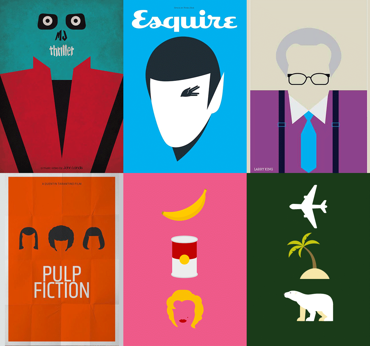
The design I suppose will consist of the features above I've mentioned. To be a little more clear about the 'minimalist graphic design' look I was talking about, here are some examples of the kind of look I was talking about that I will use.


I'm not as good as those guys but I'm just gonna try and do my own take on that style. So here's an example of that for The Jewellers:
Before and after (obviously)


So yeah that's my plan.

Thursday, 12 December 2013

Finished Digipak

The Outside (Why I Chose This)

I changed my mind a lot regarding what the cover would be. I was quite set on the fact I wanted it to be black and white to keep with the synergy of the video and the costumes. I originally went with this style:

I thought this style was promising as it was simple so it went with the simple indie image we were supposed to reflect, but we had to take our own images for the digipaks and I didn't have any, so I kept that until we took some.
Although I won't use these, I still used them as a base for my real digipak and kept some features.
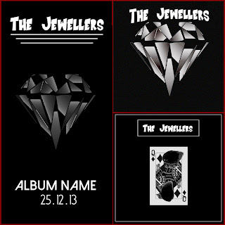
On the left is the advert. I put the font at the top and added lines below to take up space. The diamond was in the centre because synergy and the album name and release date was put at the bottom. At that point we didn't have a album name. I took a lot of inspiration from the Arctic Monkeys - AM poster. The top album cover is pretty much the same except no album name. The bottom album cover was a little different. I took a queen of diamonds card because synergy and found a burn effect, and burnt the face off to make it mysterious and keep the subtle theme we used of burning cards from our music video. I put a white border round the CD and  band name to jazz it up a bit.
They were all pretty simple, and I quite like them all, dandy.

After we took the pictures of the group, I went home and created my final digipak:
Front

I had this idea for a long time. I wanted to have the band on a police line-up to keep the theme of criminals from the music video narrative. So I took a picture that we took of the band, took a separate picture of each individual mask and put the mask on the band members face (We didn't have the masks with us for the photos). I did that because nearly all of the indie bands we are taking inspiration from only show the bands faces in 1/4 of their albums, all including their debut. I put the mugshot cards in place of the paper to make the photo look a tad more realistic and made the band black and white. I did that to keep the colour scheme continuous. Above I put the classic font of the band and made sure it was black to make it easily readable. Below I put the album name Waving Lady and replaced the A with the diamond shape. I did that because the cards are an important theme in the music video and because I didn't have an obviously clear card theme on the album, I made it slightly more subtle.
For the back, I went a bit more daring. I was originally going to go for the simple straight track list going down, but I thought that was just a bit boring, so I looked at the CD's I have and saw a lot of artists have more artistic ways of presenting the track-list, so I did as well. I took the diamond shape, took the track list, made the letters white and placed them round the diamond. I honestly think it looks really cool and much more exciting than a list. I put the licensing details at the bottom, along with the record label logo Domino, the barcode and the compact disc logo.
The spine has the band name and album name collectively because that's standard.
Inside

For the inside, I made sure I kept the colour scheme continuous to make it realistic and attractive to the audience.
On the right, I made the foreground the police line-up lines so it carries through and when I looked through other artists digipaks, the disc foreground cover is normally either an image of the artist or a pattern. On disc itself, I put the band name on the top, and the album name on the bottom. I changed the colours of them both to make sure they can be seen over black. I put the classic diamond over the centre of the disc and the result makes the disc look really cool.
The left is an image from the video Diamonds Are Forever. I wasn't sure what to put there. I tried a burning card but it didn't look  very good, and I always liked this shot where the diamond on my sleeve is visible. I thought quite a lot of people wouldn't notice it because they would watch me pointing to the map. Subtle. I also put a white diamond on the blueprint where my finger is pointing to keep the theme of white diamonds. I think this image works.