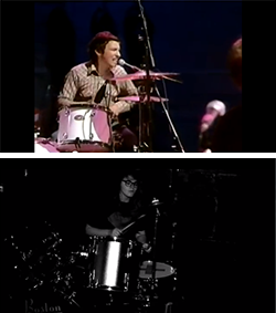
In our video we attempted to adhere to forms and conventions of real music videos whilst also being a little different and slightly challenging them. We used our knowledge of Goodwin and Vernallis' theories to inform and guide us in the making of the video.
Goodwin
If Goodwin saw our video he would probably say it was an example of 'Amplification' and I would agree. This is because our video certainly follows key elements of the lyrics (diamonds are forever), but our overall story of the diamond heist is not mentioned at all in the lyrics, but it definitely doesn't contradict them and I would actually say it's a pretty good match for the song in tone and mood.
 |
| "Diamonds are forever" Fits the lyrics introduces new meaning of heist. |
 |
| "They are all I need to please me" Fits the lyrics introduces new meaning of "I" (masked theives) and "Please" (dancing with diamonds) |
Vernallis
To make our music video look as professional as we could we tried to use many of the features that Vernallis wrote about. An example of this is obvious edits that draw attention to themselves and are also in time with the beat of the song. I have uploaded a short clip from the beginning of the video that contains a number of these features.
The cuts between shots are in time with the beat of the song, some in a more obvious way than others. An example of obvious edits would be in our use of the four-way split screen between the three band members and the diamond and how each part of the split screen appears in time with the music. The clip also contains a number of base tracks such as a close up of Steven singing, a mid-shot of Ella playing the bass and a longer shot of Steven/the band. All of these shots are repeated throughout the video in the chorus section, giving the video structure.
Which real videos influenced us?
Before we started making our video, the videos I cited as influences and inspirations for ours were from Hoobastank (The Reason) and Arctic Monkeys (I Bet You Look Good on the Dancefloor and R U Mine). I think if you look at our video you can definitely see aspects from all of these. For example...
Shot types from 'I Bet You Look Good on the Dancefloor'
The main thing we took from this video was the shot types and composition for the performance aspect of the video. We chose to use this video as it is by the same band and is a good example of the conventions of the indie rock genre. Using these shots was a way our video conformed to conventions of real music vides in our genre. Here are some shots we used:


Colour Scheme from R U Mine
From R U Mine the main thing I wanted to use from that was the 'colour' scheme, by which I mean the black and white. However it isn't just that it's black and white as there are many black and white videos it is the specific amount of black and white from the levels and the look it gives the video. I think the effect we put of black and white on our video is very similar to the one that Arctic Monkeys used in R U Mine. See the similarities here:
Storyline/Structure from The Reason
The overall storyline and idea for our video is very similar to the video for The Reason by Hoobastank (they are both diamond heists), therefore this is probably the video ours is most similar to. We used a similar structure to Hoobastank combining both performance and narrative. I would say aside from the overall structure and idea one of the main things we took from the video is the various elements of iconography of diamond heists that they feature in their video such as a blue print, diamond, safe, CCTV etc.


The Digipak & Advertisement
For my digipak and advert my influences were a little less obvious but there are still clear existing media products that helped me create this design. As far as keeping to genre conventions go I think my digipak and adverts do generally conform. I found in my research that the majority of indie bands either don't have a picture of themselves on their front cover or they have a kind of obscured picture of them so mine fits in with that.
Influences
One of my influences was Kanye West's artwork for the album 808s and Heartbreak. The main thing I took from this album was the font style as well as some of the colours.
 |
| The fonts |
 |
| The colours I used were the same. |
My other influence was a kind of minimalist graphic design style I saw online and I blogged about. I couldn't find any real albums with this exact style but here are two cartoonish type ones which I think you can draw parallels with.


No comments:
Post a Comment